

Wayfarer is a fictional travel magazine. Issues are published monthly, with a yearly “best of” special edition at the end of each year.
InDesign
Photoshop
I first looked at current travel magazines to decide the tone of Wayfarer. I noticed that a lot of current mastheads are more traditional/elegant. I wanted to make mine a little more humanist by choosing a typeface that is more inviting. Not so perfect, since travel rarely is. I wanted the photographs to be the highlight of the covers and in the articles.
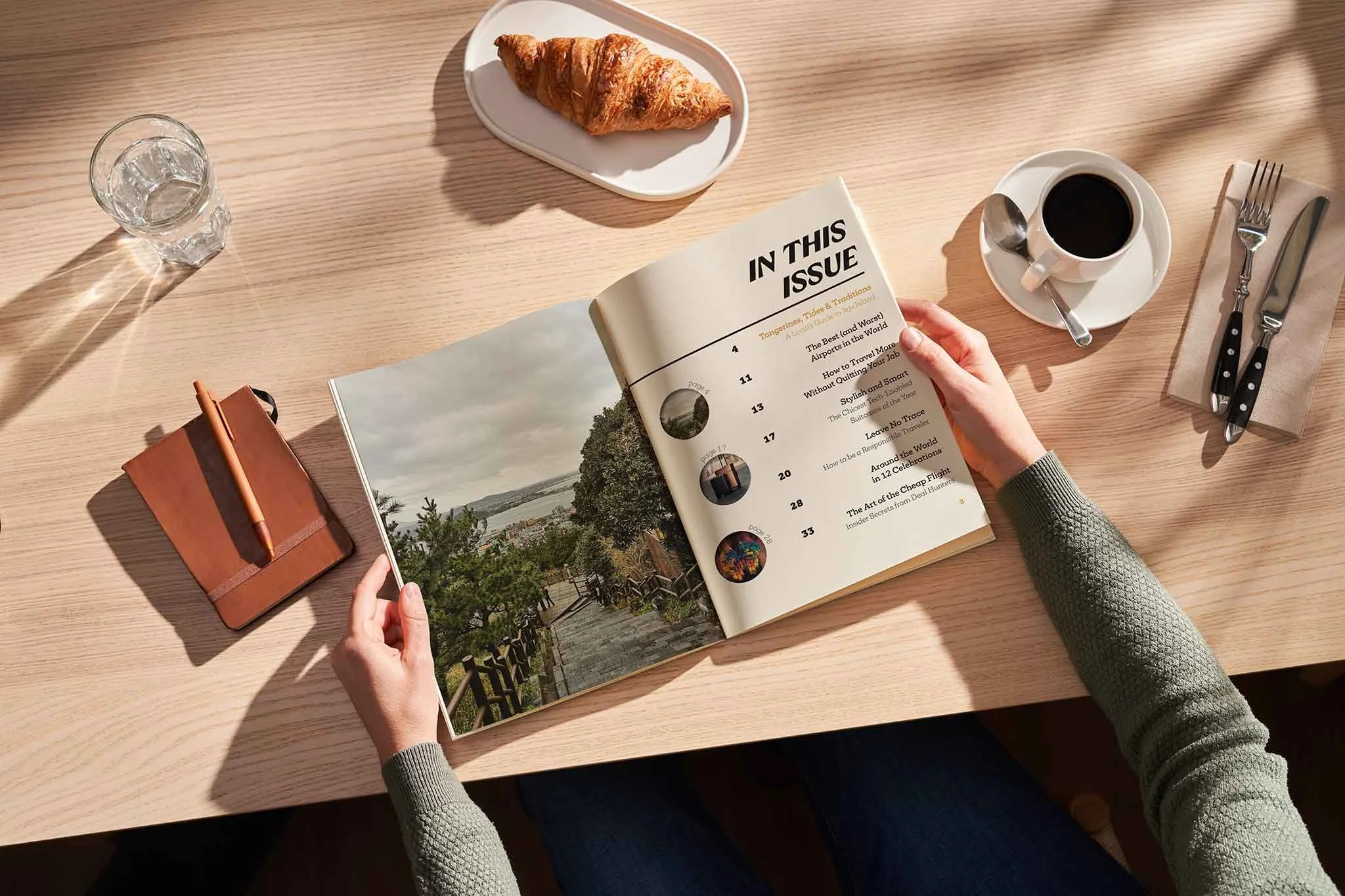
I created a set of rules to go around each cover including: the masthead, month, and magazine title (on the spine) all in one color, other articles either in black or white (depending on the background picture and visibility), and the barcode placement. For the inner spreads, I designed a full article for the April issue on Jeju Island. I varied the placement and size of each photograph within the text, letting readers have a break from the blocks of text and to give visual interest.


Cover Design System
Article Spreads
Table of Contents