

Redesign of J.D. Salinger’s classic: The Catcher in the Rye. Cover design, end paper pattern, and typographical layout.
Illustrator
InDesign
Photoshop
Procreate
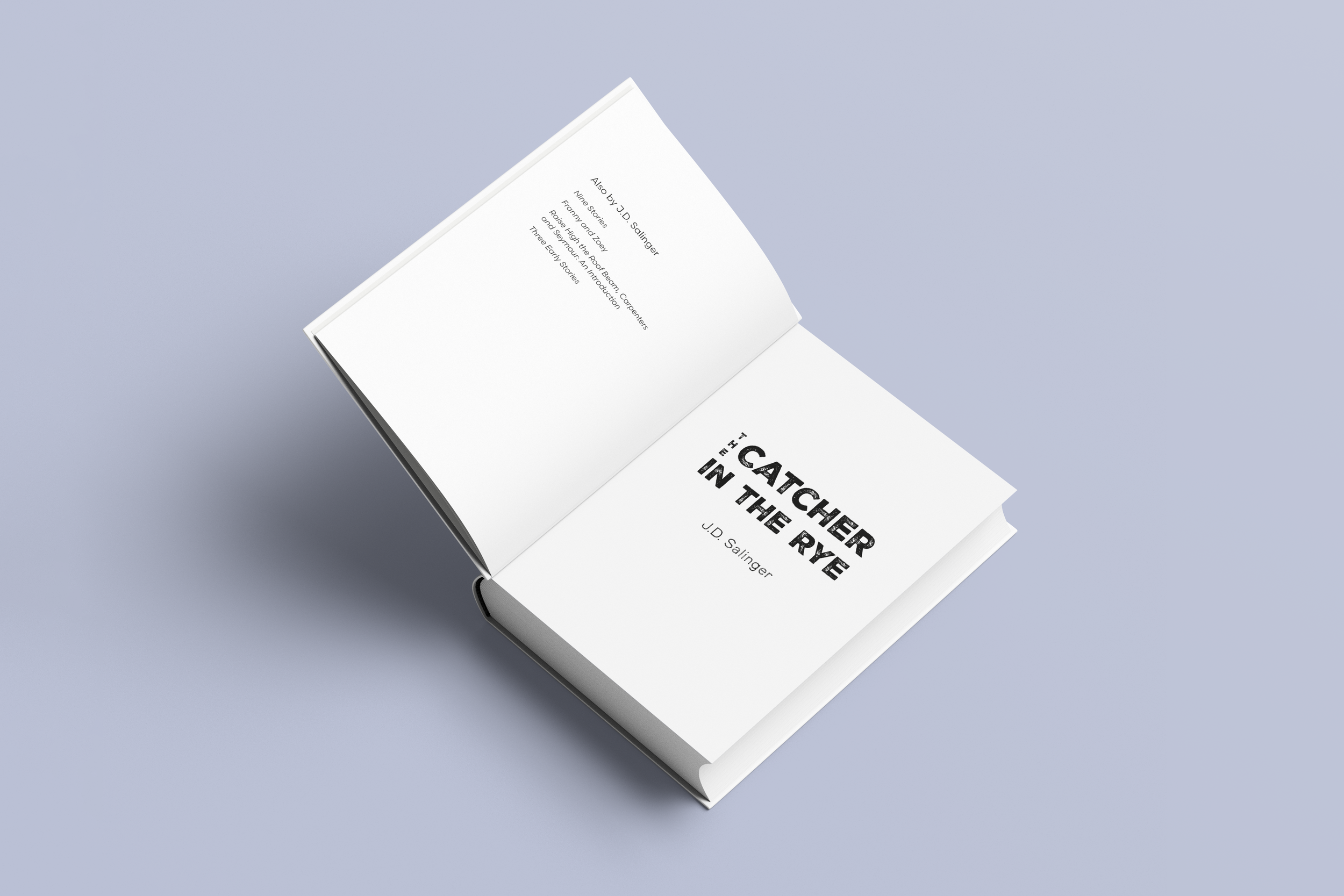
I chose The Catcher in the Rye because I’ve only ever seen two distinct cover versions; the first one being the one I read in school which was very plain and almost clinical. I wanted to make something that would still give the feeling of a modern classic but bring it up to date a bit. I also wanted the typography to be clean and well formatted.
For the cover, I sourced an image of a rye field and edited it in Photoshop, adding a grain texture overlay and muting the colors. This gave the photo a more subdued feeling which matches the main character’s mental struggles within the book. The rye field also plays a large part in the plot. To complement the grittiness of the photo, I chose a display typeface that had a rough, ink press texture. The inside text is mostly standard to fiction books, with even margins. I spent time on the leading and margins to create a comfortable reading experience. For the end papers, I designed a rye-themed pattern, keeping a muted color base.


Full Cover
Title Page
Interior Pages
End Papers Design